Wednesday, December 5, 2012

OB_5.4


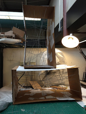
Very quickly I saw that cutting it off made the spaces very unstable. Cutting the wires took them out of the tension created by the box so  I had to go back to make the object stable.


Being out the box the object reads completely differently. Some parts aren't as successful as they were inside the box, but overall it has a really interesting relationship with the ground.

 
Gravity wants to pull the object down as the wires seem to barely hold it together, but that tension, between it falling apart/ breaking and it somehow holding itself together, makes this experiment successful.


Although I liked the outcome of the process I decided to proceed with the object inside the box. The fact that most of the original qualities of the object were lost when cut puts less importance on the box and the wire process.

The next step is to explore these spaces in drawing, with the following goals in mind:

  • Finding a "ground" line within the box.
  • Start thinking about manipulating the box itself so its not simply a shell and rather interacts with whats going on inside.
  • Taking out some of the "excess" wires that crowd spaces.
    • Think about cutting certain wires so they switch to being in compression( column-like) rather than all in tension.


 .


OB_5.3


The Process____


This is the process of taking the object out of the box(vertical)


OB_5.2

_____Inside or outside of the box??

I face the dilemma of leaving the created structure inside the context of the box or taking it out and seeing how it interacts with the ground and a different context( much like the first experiment where I cut all the wires off).

Both approaches seem appropriate, for one the project/ concept is "the box" so leaving it inside makes sense. However, the idea of cutting it out is intriguing___making this box more of a machine that just produces these spaces and "spits" them out.

Since I have two boxes__ I'll  try both: Leave the horizontal in the box and cut the vertical design.


OB_5.2

So I decided to work with the plan and the section at the same time, placing both the original plans and sections and collaged versions on the sides of the boxes.

To decide where the wires were going to pierce the box I came up with a system of coordinates. I placed 15 points on all the original drawings so that even the collaged images had the same points. By numbering all the points I simply matched the numbers from the original plan to the number on the collage plan and the same for the section.


So the test tube looks like this___


I made two boxes: One to be built vertical (sectionally) the other to be built horizontally (plan)

I wanted to see how the orientation was going to affect the design.


I was finally ready to start the design process: placing planes inside the box within the boundaries of the established structure (wires).

This is the outcome____


Tuesday, November 27, 2012

OB_5.1

My first move was to look back on the previous obstructions and the methods/laws that were provided for us. It was important to first establish my own restrictions, so I took elements from the previous obstructions that I wanted to explore more. My rules/ laws are these:


  1. Work from Original Plan and Sections 
  2. Work in model
    • Specifically Wire 
  3. Design in additive manner 
    • Explored subtracting in previous obstructions.


After determining these guidelines created two schemes.

Scheme 1___Train of thought:

Start with the plan and collage it to create a topography. Use the new created topo and introduce wire elements into the lines of the plan.
I added trace to certain parts of the wire to start to delineate space.


Scheme 2___ Train of Thought:

Created a box where I collaged the plan to the top of the box and pierced the wire through certain points of the plan.  The suspended wire created lines to which I started to add planes (chip board). The result is something that reads completely differently if inside the "box" or outside.


I like the idea of having this "test tube" that on the outside has an order ( the plan) but on the inside something completely new and unique happens that in some way has some of the properties of the original drawing.


OB_5

OBSTRUCTION 5
[final obstruction]

On Architectural Autonomy 

"It is only in that instant when the laws are silent that great actions erupt."
-Marquis de Sade

This obstruction is simply what the quote suggest; no rules, no guidelines it's all up to our interpretation______

Sunday, November 18, 2012

OB_4.FINAL

I made the site for the final model out of plaster, carving where the structure would go. Making the site separate allows for the model to  be taken apart. 

Some pictures of the mold and the complete final model________


The rest of the presentation was an exploded axon showing an elevation, plan, section and cross sections:


I also edited the original perspective drawings so that they would read a little better.


Tuesday, November 13, 2012

OB_4.2

Moving on from drawing the perspectives, I  started to create a plan..

The first attempt at a plan and sections: 

\

I drew the plan at a bigger scale in order to better understand the spaces and not oversize them like I did in some of the original perspectives. 
I used this plan as a module and repeated it a number of times to create a linear structure with characteristics from both the original perspectives. 


The plan started to become too long so I started to modify some of the modules and really began to explore the spaces within this new linear structure. 
              

 Also began to explore how I wanted the building to interact with the ground, trying different ground lines and how each one made the building read differently. 

The plan above lacked quality spaces and was at times more circulation than actual inhabitable spaces. I resolved this by not necessarily straying away from the module but refining it. 


Since some of the exterior spaces started to be just circulation and this is a narrow structure, in my new plans I experiment with exterior circulation. Also introduced "vertical" walls that break up the horizontality of the plan and create implied spaces on the exterior.

Wednesday, November 7, 2012

OB_4.1

_________After choosing which pieces of the pictures I wanted to use I started the drawing process, creating new spaces from the lines and textures of the collaged piece.


Started thinking about it a little out of scale and more exterior than interior, but interesting spaces within can be further explored. 


A space that could start to be within the bigger volume above...


Exploring different ways of letting light in...


This attempt wasn't as successful as the ones above because it was hard to connect with the other drawings, however I still enjoyed experimenting with different perspectives and think as a drawing it's not that bad. 


OB_4

OBSTRUCTION _04

"THIS + THAT"

The Fourth Obstruction keeps exploring with the collage, but in this case we have to use an interior view of the house and from parts of that image, create a new space. 

These are some views that seemed interesting____


Monday, November 5, 2012

OB 3.FINAL

Here's the final presentation and some close ups and my attempt at a "drawdel' for the site plan:


Friday, October 26, 2012

OB_3.8


This is the Piranesi Drawing I chose and my attempt at a collage of the folly within the new site. 


OB_3.7


Enclosed the top level of the plan with a "canopy" that is supported by some of the curved planes within in. 
Also, thinking about lighting I made circular openings in the canopy that followed the geometries from the walls below. I'm thinking trees would go through the openings. 


Also placed it on the site based on the Piranesi perspective. Folly begins to move inside the Colosseum above and below ground while the Arch just sits within the canopy. 


OB_3.6


Some of Van Eyck's studies for the Sonsbeek Pavilion.

Used some of the same ideas Van Eyck was playing with to help me finalize my plan and create a sense of enclosure . Although he was dealing with parallel planes and my project isn't, the idea of having almost an infinite amount of entry points and having a different experience each time is something I wanted to carry through to my project. 


Tuesday, October 23, 2012

OB_3.5


I left off with keeping the elements on the right of the plan...

and first continued by deciding this would become more of a folly within the city-scape.  then decreasing the scale of the collage so that it would be easier to work with. I decided to add new lines (curves) that were more fluid and had some of the same characteristics of the curves that were already in place. 


I went back to the method I was using in Scheme 2 where I had certain axis that helped organize the plan. I used the orientation of the orthogonal lines in the plan as the axis and created a grid. I tried to use the lines in the grid almost as tangents of the curves and also for the orientation of the major masses/ levels. 


From the grid I started to collage again and this is how the plan looks now:


Defined the 3 major elements/ layers of the plan and started to think how walls/ planes would be introduced inside of them. 


Used the axis lines to create a "paving" pattern for the separate levels. 


.......Need to continue thinking about ways of enclosure and adding more "walls/planes" within the interior